One nice thing about the bisexuality is it makes hatefucking seem more accessible: I don’t know that I’ve even ever been around an attractive woman I’ve actively loathed in a way to generate the heat for that in adulthood but I have encountered fuckable gay men who came off as supercilious or irritating.
Hey, gays who were around in the ‘90s, look back and reevaluate things with the insight that male bisexuality, only then being acknowledged as a thing at all, is as common as then-voguish female bisexuality!
That “straight” jock your friend got to feed him loads in college? That was a bisexual man.
The married guy you were fucking who would never leave his wife and their perfect life? That’s because he was a bisexual man, he in fact liked being married to her, he was just committing adultery, which married men are known to do.
The preacher thumping on about the sanctity and primacy of heterosexual marriage who was found to be picking up men on the road? He wasn’t “self-hating” gay, that was a bisexual man. “Preacher talks up married fidelity in sermons, has side pieces” is an old story.
The father in the pews with an intuitive sense that it is both necessary and useful to communicate to humans that same-sex relations are wrong and it’s opposite-sex ones that are right, so that they order their lives properly – that was a bisexual man.
We’ve been here all along, nu?
Q: isn’t framing a common theme of bisexuals as infidelity with the other sex exactly what bisexual women were complaining about circa their 1990s moment in the sun?
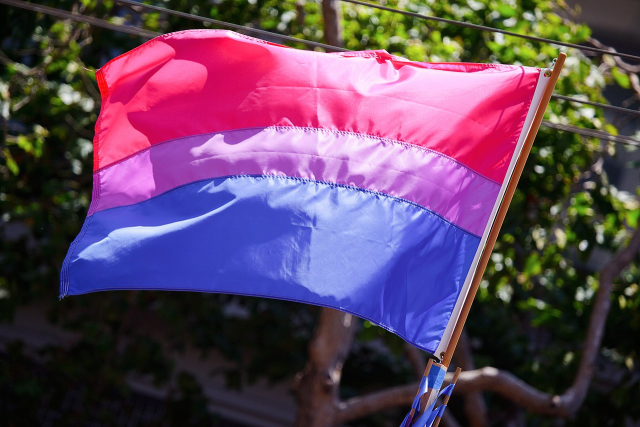
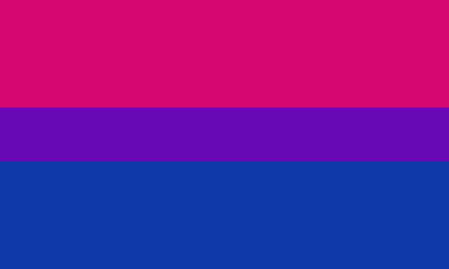
as a bi person, the bisexual flag brings me infinite joy and always puts a smile on my face, however as a person who has a Passion for Graphic Design, that undersaturated shade of purple infuriates me when it’s used digitally
like, on an actual flag - which was its original purpose - it looks great!
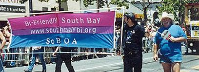
ALT
ALT
those look fine! lovely, even! with the semi-transparent fabric, the way it catches the sunlight, it looks beautiful!
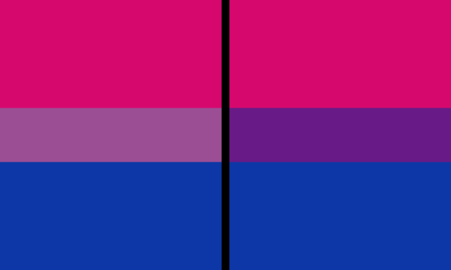
but now look at how it looks digitally
the pink and blue are so vibrant compared to the sad, lonely lavender!
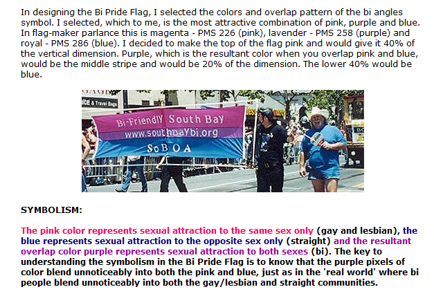
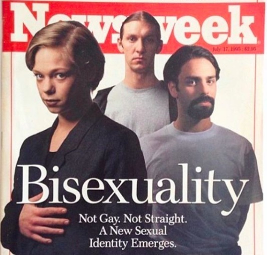
and let’s look at this statement from Michael Page, the creator of the bi flag:
ALT
(sidenote: he created this flag in 1998, so if his takes on bisexuality is different from yours, it’s okay to notice that! a lot has changed since the 90s when it comes to lived experiences and the way we describe them. but, it’s also important to respect his thoughts about this and the way he presented them, even if today, we’d probably not say that bi people “blend unnoticeably into both the gay/lesbian and straight communities.”)
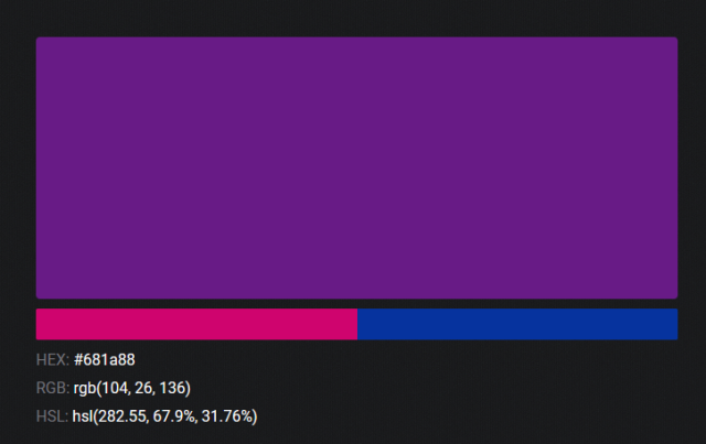
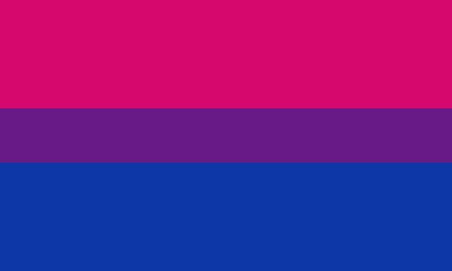
so in pantone colors, the pink is 226 C, the blue is 286 C, and the purple of the flag is 258 C.
but…here’s the deal
Michael talks here about how the key to understanding the symbolism is to know that the purple blends into both the pink and blue. and on a physical flag, I think you can see that!
but digitally, it absolutely does not blend. it clashes badly, and looks oddly separate from the other two colors.
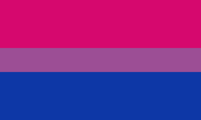
which got me wondering…what purple do you get if you actually blend 226 C and 286 C?
oh! oh, my god.
look at that! look at how nicely it fits between those colors!
look at it next to the original color scheme! look at how much more vibrant the purple is!
and friends. this is just blending through rgb! you get even more purple variations when you use other color spaces!
look at all of the different purple options you can get just by combining these two colors!
if you want almost too-vibrant saturation, you can go hsl, if you want something more relaxed that’s closer to the original, you can go lab or lrgb. and if you want to split the difference, lch is bright and violet, while rgb is there with its saturated but darker purple.
anyway, I guess I don’t really have a point here? this isn’t so much an informational post as it is Me Getting Weird About Colors, but I think it is a useful lesson about how colors look very different on screens compared to how they look on objects in real life.
and sometimes, I think it’s okay to compensate for that.
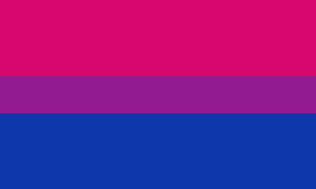
out of all of these, this is my favorite bi flag:
it’s the one where the colors were blended in lab color space. for me, the lighter, softer purple is close enough to the original bi flag purple, while also feeling like a smoother blend of the blue and pink
but that’s just me! and it might not even look the same to you, since every screen is different, because technology is a nightmare!
anyway, thank you for coming with me on this colorful journey! I will now retreat back to inkscape and make pained sounds about inkstitch gradients until something tangible pulls me back into reality
You know, Chasing Amy might best be thought of as coming out of the early ‘90s period where we developed a mature account of “homosexual” before we did of “bisexual”. If you understand Alyssa as a bisexual whose lesbian self-conception is important to her '90s “alternative” identity positioning, the possibility of involvement with a man has comprehensible and interesting stakes.