Okay, more picking off crap grass, four buckets of it, also some chopping some thin branches up into debris kibble, and realizing a lot of the “firewood” I’ve been husbanding is really too thick to burn intact but a bitch to split, so if I really want to make good use of these fruits of the yard I can just dump them in a depression to the side of Blueberry Hill to rot over 5 years.
Tomorrow the last of that, using staples to shape some branches’ growth around trunks, and preparing some planters to receive some plants currently in areas that’re gonna be landscaped away.
Huh the pole replacement works like they plant a pole in the pavement next to where the last one was while the old one still stands, have guys at the top switch stuff over from the old to the new one, and then they take the old one down. Makes sense, but wasn’t immediately obvious.
This is actually gonna make it appreciably easier to build a walk to the basement unit door, along with relocating that line when the mimosa was trimmed, linemen doing me a solid recently.
Just forgot I now have the ability/curse to flawlessly rehear any song I’ve ever heard in the ambient noise around me and made the mistake of thinking about Third Eye Blind while weeding
Holy shit, that thing about your mom finding the boxes. Thats nuts. What did she do with them?! please tell me she didnt throw them away. That is so interesting.
Well she presumably put them back in the folders and filed them away. This would’ve been Philadelphia in the 70s.
hey why are the Van Helsings always the Vampire Hunting Family in modern Dracula stories. Abraham Van Helsing might be the guy who knows stuff but his family is off in the Netherlands and/or dead and totally uninvolved in the plot. Abraham’s great-great grandson has no reason to be doing backflips and chopping off heads or whatever
You know who is a family who hates Dracula so so much and would totally teach their kids how to hunt vampires? The Harkers. Give me a modern vampire story where the protagonists are about to die when out pops Quincey Arthur John Lucy Abraham Murray Harker the Fifth, armed with a giant knife and an encyclopedic knowledge of train schedules
I think it’s a combination of the fact that Van Helsing is a really cool name combined with him being the one to kill Dracula in both Universal Studios’ 1931 movie with Bela Lugosi, and Hammer’s Horror of Dracula. The Hammer film was probably the first time he was portrayed as a professional vampire hunter.
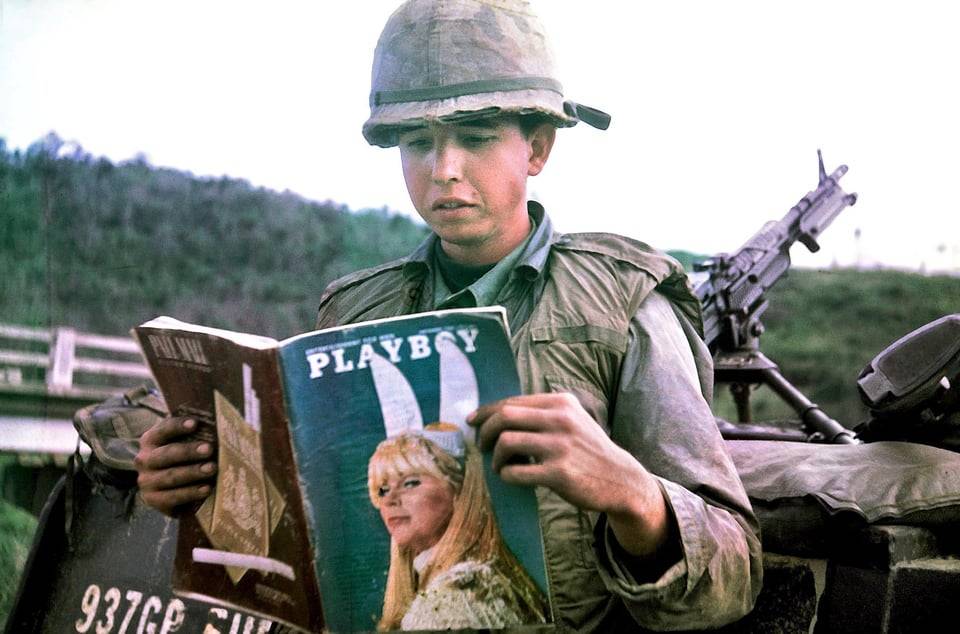
Combat
engineer Daniel Mouer “reading an article and not ogling the
centerfold”. The magazine was sent by his wife, along with a batch of
chocolate chip cookies. Vietnam 1966
For my linguistsics degree, I did a project on why I’m seeing more people saying “on accident” instead of “by accident.” I looked at almost a million pieces of writing pulled from news sites, blogs, academic articles and television transcripts. I found almost three hundred cases of “on accident” being used. It was a surprisingly even spread across sources. Even more interesting, I organized the hits by date and tracked an upward swing in use as time goes on. This means that the use of “on accident” is increasing over time, and may eventually supplant and drive out the classic usage of “by accident.” I like to call this prepositional shift.
Now, looking at my data and looking at the age ranges of the writers or speakers, the majority of them were under the age of thirty. So I interviewed a panel of people, choosing twenty with a spread of about half above thirty, and half below. Those older than thirty years of age felt “strongly” or “very strongly” that “on accident” was wrong in all cases, and that “by accident” was the only correct phrase. However, those younger than thirty were much less rigorous, with more than half feeling “ambivalent” or “less strongly” about which was correct. This demonstrates a generational link in preposition usage.
When presented with options for the definitions of “by” and “on,” we also get some interesting data. For by, there are two main definitions according to the Oxford English Dictionary: 1. Identifying the agent performing an action. Or 2. Indicating the means of achieving something. Whereas “on” has many more definitions, the pertinent ones being 1. To indicate the manner of doing something or 2. To indicate active involvement in a condition or status. By the above definitions, either “by accident” or “on accident” is a correct usage of the term. However, native speakers of English could not successfully define either preposition, instead just choosing one, the other, or both as “sounding correct.”
The only evidence for a rule-based shift that I could find was a correlation with the paired phrase for the opposite condition “on purpose.” While the younger interviewees were ambivalent about the correctness of “on accident,” they uniformly rejected the correctness of the suggested phrase “by purpose.” So the shift can only be in one direction according the the native ear, towards the preposition “on.”
Whether this means that the particular usage of “by” is becoming archaic or the definition of “on” is expanding is a possible subject of further study using a wider range of phrases. But I found the wider acceptance of “on accident” versus “by accident” to be a fascinating look at how prepositions can shift meaning and usage over time.
So now I’m curious, five years from my initial study (and itching to try the Tumblr poll feature):
Huh the pole replacement works like they plant a pole in the pavement next to where the last one was while the old one still stands, have guys at the top switch stuff over from the old to the new one, and then they take the old one down. Makes sense, but wasn’t immediately obvious.
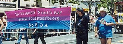
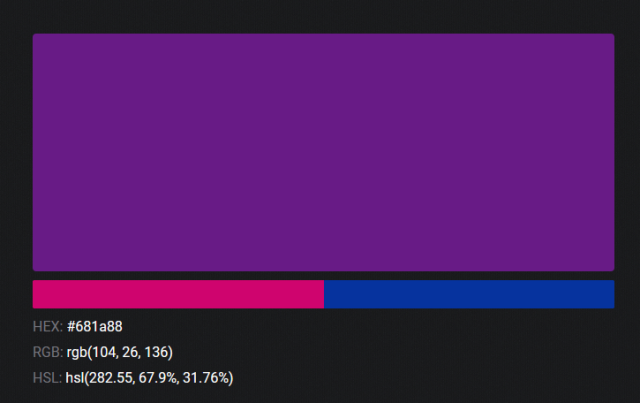
as a bi person, the bisexual flag brings me infinite joy and always puts a smile on my face, however as a person who has a Passion for Graphic Design, that undersaturated shade of purple infuriates me when it’s used digitally
like, on an actual flag - which was its original purpose - it looks great!
ALT
ALT
those look fine! lovely, even! with the semi-transparent fabric, the way it catches the sunlight, it looks beautiful!
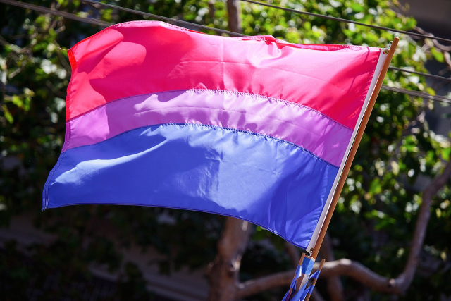
but now look at how it looks digitally
the pink and blue are so vibrant compared to the sad, lonely lavender!
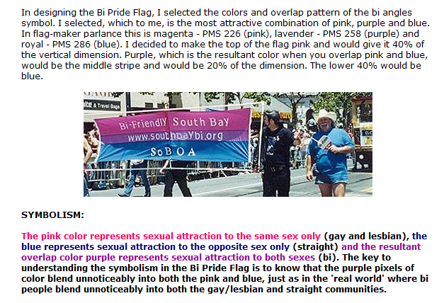
and let’s look at this statement from Michael Page, the creator of the bi flag:
ALT
(sidenote: he created this flag in 1998, so if his takes on bisexuality is different from yours, it’s okay to notice that! a lot has changed since the 90s when it comes to lived experiences and the way we describe them. but, it’s also important to respect his thoughts about this and the way he presented them, even if today, we’d probably not say that bi people “blend unnoticeably into both the gay/lesbian and straight communities.”)
so in pantone colors, the pink is 226 C, the blue is 286 C, and the purple of the flag is 258 C.
but…here’s the deal
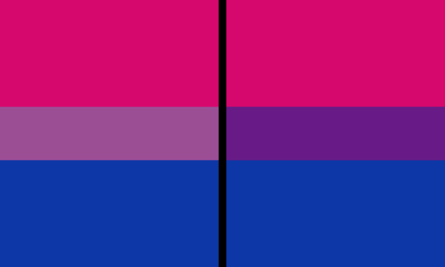
Michael talks here about how the key to understanding the symbolism is to know that the purple blends into both the pink and blue. and on a physical flag, I think you can see that!
but digitally, it absolutely does not blend. it clashes badly, and looks oddly separate from the other two colors.
which got me wondering…what purple do you get if you actually blend 226 C and 286 C?
oh! oh, my god.
look at that! look at how nicely it fits between those colors!
look at it next to the original color scheme! look at how much more vibrant the purple is!
and friends. this is just blending through rgb! you get even more purple variations when you use other color spaces!
look at all of the different purple options you can get just by combining these two colors!
if you want almost too-vibrant saturation, you can go hsl, if you want something more relaxed that’s closer to the original, you can go lab or lrgb. and if you want to split the difference, lch is bright and violet, while rgb is there with its saturated but darker purple.
anyway, I guess I don’t really have a point here? this isn’t so much an informational post as it is Me Getting Weird About Colors, but I think it is a useful lesson about how colors look very different on screens compared to how they look on objects in real life.
and sometimes, I think it’s okay to compensate for that.
out of all of these, this is my favorite bi flag:
it’s the one where the colors were blended in lab color space. for me, the lighter, softer purple is close enough to the original bi flag purple, while also feeling like a smoother blend of the blue and pink
but that’s just me! and it might not even look the same to you, since every screen is different, because technology is a nightmare!
anyway, thank you for coming with me on this colorful journey! I will now retreat back to inkscape and make pained sounds about inkstitch gradients until something tangible pulls me back into reality
I was listening to some Chaotic Neutral space rock and imagining one of those ads that is a list of words that are all related to each other in bizarre ways
You know the type: “Looking for a new idiom to describe your relationship to your lover? What if you told them they were ‘the bologna in your cheese sandwich’”
i was reading a book on scriptwriting and it was explaining about setting up last-act payoffs and for an example started describing a suspense movie i’ve never seen, where in the first act the cop main character wants to hide his job from the love interest and so hides his big official police marksmanship trophy under his bed
and i was like, okay, sure, now the end of the movie’s all set up so he can do some expert high-stakes sharpshooting, but then it goes on to describe how in the climax the villain tries to murder the hero in his sleep, and in the struggle the hero… reaches under his bed and beats the villain to death with the trophy
so i guess chekhov’s gun has a fun new corollary: if there’s a gun on the wall in the first act, in the third act you can take it down and just fucking wail on someone with it
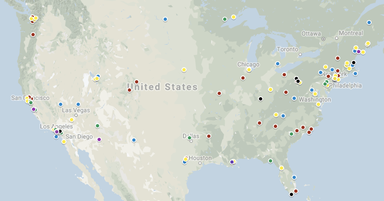
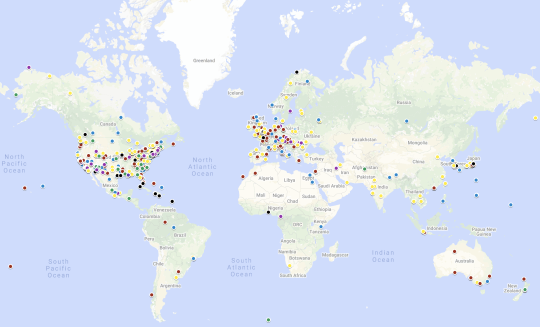
Spent the last four hours or so starting on a new project: mapping the locations of famous horror movies set in America. It’s a work in progress, y’all’ see more when I’m done.
this is like when the RAF tried to figure out where to armour their bombers by looking at the distribution of bullet holes; the empty area on the map is where nobody lived to tell the tale.
It follows population density pretty closely except that the desert Southwest is over represented. Is that because it’s close to Hollywood? Cheap to shoot in? High density of chupacabras?
That’s just where the spooky is. Everything else is just noise from large populations.
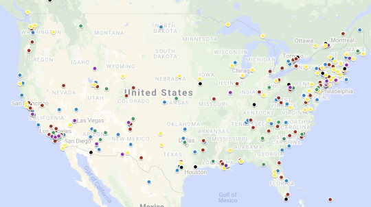
Since @argumate brought this back, here’s what the map looks like today:
I started adding any horror movie at all, not just well-known ones. Also, it’s global now!
It lets you look at some cool regional trends, like how ghosts are huge in New England while aliens and vampires have a cluster in the Southwest.
that the original had a lot of black in Pittsburgh is unsurprising, given where a certain George Romero came from, but it now has an interesting relative density and variety.
(i blame the Tom Savini practical effects school in Monessen, personally)
I wish this was an interactive map I want to find and watch my “local” horror movies!
Ask and you shall receive! Here’s a link to explore the map for your local horror movies!
On iOS the input that triggers the “undo” feature is shaking the phone.
It’s so fucking stupid I can’t believe anyone came up with it and people took a look at it like LGTM, and it went through implementation and testing and no one ever said “this is fucking bullshit”
The devil, right after inventing tap-to-click: “Wait, I got another idea.”
I recently realized you can trigger this by shaking side-to-side like waving, before I was headbanging it.